


时间:2020-02-14 浏览量:
")
1.winphone系统a、input标签被点击时产生的半透明灰色背景怎么去掉
<meta name="msapplication-tap-highlight" content="no">
1、关闭iOS键盘首字母自动大写
<input type="text" autocapitalize="off" />
2、禁止文本缩放
html {
-webkit-text-size-adjust: 100%;
}
3、移动端如何清除输入框内阴影
在iOS上,输入框默认有内部阴影,但无法使用 box-shadow 来清除,如果不需要阴影,可以这样关闭:
input,
textarea {
border: 0;
-webkit-appearance: none;
}
4、忽略页面的数字为电话,忽略email识别
<meta name="format-detection" content="telephone=no, email=no"/>
5、快速回弹滚动
.xxx {
overflow: auto;
-webkit-overflow-scrolling: touch;
}
PS:iScroll用过之后感觉不是很好,有一些诡异的bug,这里推荐另外一个 iDangero Swiper,这个插件集成了滑屏滚动的强大功能(支持3D),而且还有回弹滚动的内置滚动条,官方地址:
http://www.idangero.us/sliders/swiper/index.php
6、移动端禁止选中内容
div {
-webkit-user-select: none;
}
7、移动端取消touch高亮效果
在做移动端页面时,会发现所有a标签在触发点击时或者所有设置了伪类 :active 的元素,默认都会在激活状态时,显示高亮框,如果不想要这个高亮,那么你可以通过css以下方法来禁止:
.xxx {
-webkit-tap-highlight-color: rgba(0, 0, 0, 0);
}
8、如何禁止保存或拷贝图像
通常当你在手机或者pad上长按图像 img ,会弹出选项 存储图像 或者 拷贝图像,如果你不想让用户这么操作,那么你可以通过以下方法来禁止:
img {
-webkit-touch-callout: none;
}
PS:需要注意的是,该方法只在 iOS 上有效。
9、解决字体在移动端比例缩小后出现锯齿的问题:
-webkit-font-smoothing: antialiased;
10、栅格布局:
box-sizing:border-box;可以改变盒子模型的计算方式方便你设置宽进行自适应流式布局
11、input[type=input]{-webkit-appearance:none;}移除ios的样式,但这个属性存在bug,会导致iso无法获取checkbox值,给这个元素重新赋上input[type=checkbox]{-webkit-appearance:checkbox;}就不会报错了。
12、按钮被按下效果的实现需要给a标签加a:active属性和添加一段空函数
document.body.addEventListener('touchend', function () { });13、解决去掉下边框:
-webkit-border-bottom:none;
14、英文文本换行(不拆分单词):
word-wrap:break-word
15、字体大小尽量使用pt或者em,rem,代替px。
16、设置input里面placeholder字体的大小
::-webkit-input-placeholder{ font-size:10pt;}17、wap页面有img标签,记得加上display:block;属性来解决img的边缘空白间隙的1px像素。如果图片要适应不同的手机要设置width:100%;而且不能添加高度。
18. 移动端如何清除输入框内阴影
在iOS上,输入框默认有内部阴影,但无法使用 box-shadow 来清除,如果不需要阴影,可以这样关闭:
input,
textarea {
border: 0;
-webkit-appearance: none;
}
19. 移动端禁止选中内容
如果你不想用户可以选中页面中的内容,那么你可以在css中禁掉:
.user-select-none {
-webkit-user-select: none;
-moz-user-select: none;
-ms-user-select: none;
}
兼容IE6-9的写法:
onselectstart="return false;" unselectable="on"
20.audio元素和video元素在ios和andriod中无法自动播放
应对方案:触屏即播
$('html').one('touchstart',function(){
audio.play()
})
21.手机拍照和上传图片
<input type="file">的accept 属性
<!-- 选择照片 -->
<input type=file accept="image/*">
<!-- 选择视频 -->
<input type=file accept="video/*">
ios 有拍照、录像、选取本地图片功能
部分android只有选取本地图片功能
winphone不支持
input控件默认外观丑陋
22. 消除transition闪屏
.css{
-webkit-transform-style: preserve-3d;
-webkit-backface-visibility: hidden;
}
23.开启硬件加速 解决页面闪白 保证动画流畅
.css {
-webkit-transform: translate3d(0, 0, 0);
-moz-transform: translate3d(0, 0, 0);
-ms-transform: translate3d(0, 0, 0);
transform: translate3d(0, 0, 0);
}设计高性能css3动画的几个要素
尽可能地使用合成属性transform和opacity来设计CSS3动画,
不使用position的left和top来定位
利用translate3D开启GPU加速
**************************************************************************
框架
1. 移动端基础框架
zepto.js 语法与jquery几乎一样,会jquery基本会zepto~
iscroll.js 解决页面不支持弹性滚动,不支持fixed引起的问题~ 实现下拉刷新,滑屏,缩放等功能~
underscore.js 该库提供了一整套函数式编程的实用功能,但是没有扩展任何JavaScript内置对象。
fastclick 加快移动端点击响应时间
animate.css CSS3动画效果库
Normalize.css Normalize.css是一种现代的、CSS reset为html5准备的优质替代方案
2. 滑屏框架
适合上下滑屏、左右滑屏等滑屏切换页面的效果
slip.js
iSlider.js
fullpage.js
swiper
3.瀑布流框架
masonry
工具推荐
caniuse 各浏览器支持html5属性查询
paletton 调色搭配
对于网站字体设置
移动端项目:
font-family:Tahoma,Arial,Roboto,"Droid Sans","Helvetica Neue","Droid Sans Fallback","Heiti SC",sans-self;
移动和pc端项目:
font-family:Tahoma,Arial,Roboto,"Droid Sans","Helvetica Neue","Droid Sans Fallback","Heiti SC","Hiragino Sans GB",Simsun,sans-self;
有关Flexbox弹性盒子布局一些属性
不定宽高的水平垂直居中
.xxx{
position:absolute;
top:50%;
left:50%;
z-index:3;
-webkit-transform:translate(-50%,-50%);
border-radius:6px;
background:#fff;
}
[flexbox版]不定宽高的水平垂直居中
.xx{
justify-content:center;//子元素水平居中,
align-items:center;//子元素垂直居中;
display:-webkit-flex;
}
单行文本溢出
.xx{
overflow:hidden;
white-space:nowrap;
text-overflow:ellipsis;
}
多行文本溢出
.xx{
display:-webkit-box !importmort;
overflow:hidden;
text-overflow:ellipsis;
word-break:break-all;
-webkit-box-orient:vertical;
-webkit-line-clamp:2;(数字2表示隐藏两行)
}
使用流体图片
img{
width:100%;
height:auto;
width:auto\9;
}
一像素边框(例子:移动端列表的下边框)
.list-iteam:after{
position: absolute;
left: 0px;
right: 0px;
content: '';
height: 1px;
transform: scaleY(0.5);
-moz-transform: scaleY(0.5);
-webkit-transform:scaleY(0.5);

}
针对适配等比缩放的方法:
@media only screen and (min-width: 1024px){
body{zoom:3.2;}
}
@media only screen and (min-width: 768px) and (max-width: 1023px) {
body{zoom:2.4;}
}
@media only screen and (min-width: 640px) and (max-width: 767px) {
body{zoom:2;}
}
@media only screen and (min-width: 540px) and (max-width: 639px) {
body{zoom:1.68;}
}
@media only screen and (min-width: 480px) and (max-width: 539px) {
body{zoom:1.5;}
}
@media only screen and (min-width: 414px) and (max-width: 479px) {
body{zoom:1.29;}
}
@media only screen and (min-width: 400px) and (max-width: 413px) {
body{zoom:1.25;}
}
@media only screen and (min-width: 375px) and (max-width: 413px) {
body{zoom:1.17;}
}
@media only screen and (min-width: 360px) and (max-width:374px) {
body{zoom:1.125;}
}
RELATED RECOMMEND
2020-02-14
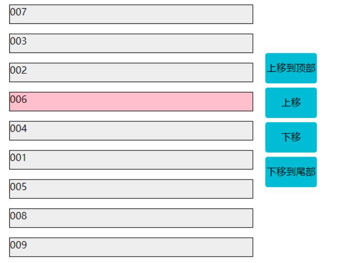
通过Jquery控制元素上下移动,进行排序是比,功能齐全的实现方式。下面是基础的引入jq和html元素部分:<script src="http://code.jquery.com/jquery-1.10.2.js"></script><style type="text/css">.content{floa
2020-02-14
PS 、DW这是必备的工具,你还要会一些美术设计,懂一些颜色搭配,视频剪辑,一般来说,优秀的网站是几个人,或一个团队来完成的,大家分工不同,术有专攻。要想做一个高大上的移动网站,主要涉及到2个部分,服务器要稳定,页面要酷炫实用1、服务器要稳定如果一个网站一会能访问,一会不能访问,或者反应速度很难,一般一个页面的响应时间超过1s,用户就会感觉到交互缓慢,所以为了保证稳定,一般会用成熟的云服务,如阿里
2020-02-14
现在做网站的话一般都是电脑端和手机端一同搭建,由于现在用手机端的用户也是比较多的,比较便利,所以现在手机端的优化也是十分的重要的。咱们今天咱们一同讨论下移动端的应该怎样样去做好优化。1.网站的logo在电脑端的网站一般都是logo在左边,由于这样比较夺目,让客户简单关注到,同理咱们的移动端也是需求的,可是由于咱们移动端的网站和pc端的屏幕的大小是不一样的,假如咱们移动端也放上logo,这样的话会便

Copyright © 2012-2025世敏网络 版权所有 闽ICP备18026760号-1  闽公网安备 35020502000640号 网站地图 Sitemap 关键词聚合


 简体中文
简体中文 繁體中文
繁體中文